

Add-to-cart rate sits near the top of almost every dashboard we inherit. It looks like intent. Then it jumps after a design change, and revenue refuses to follow. That gap usually traces back to the metric itself. This piece breaks down six ecommerce metrics that survive in weekly reporting long after they stop explaining anything, plus the replacements we build instead. You will get the GA4 event mechanics behind the inflation, the margin blind spot buried inside average order value, and a straight comparison of Marketing Efficiency Ratio (MER) against ROAS. Every example comes from an account we have rebuilt, and the fixes ship this quarter without new software.
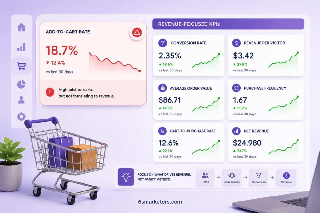
A supplements brand came to us last spring with a chart they were proud of, pasted straight into their board deck. Cart adds climbing quarter over quarter following a mobile redesign. Revenue across the same window: flat.
So we pulled the GA4 event stream. The redesign had shipped a quick-add button on collection pages and a sticky cart bar on product pages. Both fired add_to_cart. A shopper switching from Berry to Citrus fired it twice. A shopper bumping quantity from one tub to two fired it again. The numerator had roughly doubled. The count of actual humans reaching checkout had not moved a single point.
That is the shape of the problem with most ecommerce metrics that get promoted to dashboard status. They measure something real. The room reading the deck simply believes they measure something else, and nobody audits the gap until a quarter goes sideways.
Key Takeaways on Ecommerce Metrics Worth Replacing
- Add-to-cart events double-count variants and quantity changes
- Gross revenue hides returns, refunds, and margin
- MER reads blended spend efficiency better than ROAS
- Segment conversion rate before trusting any average
- Contribution margin per order outranks average order value
- Revenue per visitor ties traffic directly to money
Why Add-to-Cart Rate Hides Your Real Revenue Story
Add-to-cart rate misleads on two fronts. It counts events where you assume it counts people, and a large share of the shoppers inside that number were never buying anything anyway. Baymard Institute reports an average cart abandonment rate of 70.22% based on findings from 50 studies. Its survey data also indicates that 42% of online shoppers in the U.S. abandoned their carts because they were browsing or not ready to buy.
Read that second figure again. Almost half the abandonment in your funnel is window shopping, which is a healthy sign of catalogue discovery. A wishlist feature would move that number faster than any checkout redesign.
Then there is the counting problem. Google’s own ecommerce documentation shows add_to_cart firing on the interaction itself, with separate events available for view_cart and remove_from_cart. Most Shopify stores we audit have never implemented those last two. So the cart fills up in reporting and never empties.
We usually start diagnosis somewhere else entirely. Session recordings and heatmaps that reveal how visitors actually move through a page tell you whether a shopper hesitated at the shipping estimate or bailed at the size chart. The event log cannot do that.
The Problem With Vanity Metrics in Ecommerce Reporting
A vanity metric is any number that can move meaningfully without the bank balance moving at all. That is the whole test. Run every line of your weekly deck through it.
Sessions fail it. So do page views, engagement rate, and email opens, ever since Apple Mail Privacy Protection began prefetching images. These ecommerce metrics still have a job. They are diagnostic. A common pitfall is turning an explanatory metric into a performance objective. The result is weeks or months spent chasing improvements in a number that doesn’t directly drive business results.
This is the most common mistake we encounter. A brand runs a 20% sitewide promotion. Conversion rate jumps. Cart adds jump. A small decrease in average order value often slips under the radar since headline revenue continues to look strong. Three weeks later, the finance team runs the arithmetic. On a product carrying 60% gross margin, a 20% discount drops margin to 50% and takes a third of the gross profit per unit with it. The promotion had also pulled forward demand arriving anyway at full price.
Every metric in that deck was accurate. The reporting still produced a bad decision.
If your last quarterly review ended with more questions than answers, talk to our ecommerce analytics team about a reporting audit before you rebuild anything.
6 Ecommerce Metrics You Should Stop Relying On and What to Measure Instead
These six swaps are the ones we make first on almost every account. None of them require new tooling. Most require an afternoon in GA4 and a conversation with whoever owns your P&L. Better ecommerce metrics rarely arrive through a new platform purchase.
1. Replace Add-to-Cart Rate With Checkout Initiation Rate
Checkout initiation rate divides begin_checkout events by sessions containing an add to cart. Of the people who showed real interest, how many would hand over an address? Duplicate add events wash out. Wishlist behaviour stops polluting the read. Track it at device level. Mobile and desktop diverge hard here, and the blended figure hides both.
2. Replace Site Conversion Rate With Revenue Per Visitor
Site-wide conversion rate averages a returning email subscriber against a cold Meta click. Those two have nothing in common. Revenue per visitor multiplies conversion rate by average order value, so a traffic source that converts at 1.1% but sells $420 baskets stops looking worse than one converting at 3% on a single $45 discounted item. Segment it by channel and by new versus returning. The picture usually reverses.
3. Replace ROAS With Blended Marketing Efficiency Ratio
ROAS reports what a platform claims it caused. Marketing Efficiency Ratio divides total revenue by total advertising spend across every channel, and it does not care what any ad platform believes about attribution. Branded search is where this bites hardest. Benchmarks put brand search ROAS around 8x to 15x against 3x to 6x for non-brand, and that gap exists because branded terms capture demand that already exists. One homeware client sat comfortably inside the band for two quarters while MER refused to move. The campaign was buying customers who typed the brand name and were arriving anyway.
4. Replace Average Order Value With Contribution Margin
Average order value treats a $120 bundle of heavy ceramics the same as a $120 order of lightweight skincare. Contribution margin per order subtracts cost of goods, pick and pack, shipping, payment processing, and expected returns. We rebuilt this for an apparel client and found their top revenue product ranked seventh once returns landed. Sizing inconsistency on one dress was quietly funding a return rate at the top of its category range.
5. Replace Gross Revenue With Net Revenue After Returns
Google Analytics supports a refund event that most implementations never fire, which means the revenue in your dashboard is gross while the revenue in your bank is net. In apparel, where returns run 20% to 40% of orders against a cross-category average near 20%, your dashboard can carry a quarter more revenue than your bank ever sees. Fire the refund event, or reconcile monthly against your payment processor. Then rank products, campaigns, and creative by what survives the return window. Day-one checkout totals flatter everything.
6. Replace Email Open Rate With Revenue Per Email Sent
Open rate stopped being trustworthy the moment mail clients began prefetching tracking pixels on the recipient’s behalf. Revenue per email sent divides attributed revenue by delivery volume, which makes list bloat visible immediately. Klaviyo’s own segmentation data puts revenue per recipient at $0.19 for highly segmented sends against $0.06 for unsegmented blasts. One client cut send volume hard, watched open rate fall, and grew campaign revenue. Their unengaged segment had been inflating the denominator for two years without anyone noticing.
Building a Revenue-Focused Ecommerce Analytics Dashboard
Build in three tiers. Money at the top, behaviour in the middle, diagnostics at the bottom, and hold that order without exception.
Tier one carries net revenue, contribution margin, MER, revenue per visitor, and new customer revenue. Five numbers. If a stakeholder can absorb only one screen, this is the screen.
Tier two carries checkout initiation rate, repeat purchase rate inside 90 days, and revenue per email sent. These explain tier one.
Tier three holds everything diagnostic. Add-to-cart rate lives here, along with sessions, bounce, and page speed. Keep them visible. Ranking them alongside revenue causes the damage.
One rule we enforce: Every tier metric needs a named owner and a documented formula stored outside the dashboard. Three people will otherwise calculate MER three ways by March.
Once the money layer is stable, the behaviour layer tells you where to run tests. That is the point at which proven CTA optimization tactics for higher conversions start earning their keep, because you can finally see which changes reach the P&L.
Best Practices for Ecommerce Reporting That Hold Up
Reconcile to finance monthly. Analytics revenue and Shopify revenue will disagree. Document the variance and its cause. A stable 4% gap you understand beats a perfect number you cannot explain.
Report ranges. Weekly figures move on noise. We use a rolling 28-day window against the prior 28, which kills most of the false alarms that eat Monday meetings.
Kill a metric every quarter. Dashboards accumulate, and nobody removes anything. Delete the least-used number on the board, then wait to see whether anyone asks.
Write the interpretation beside the chart. A number with no sentence attached means something different to every reader.
Test the counting before trusting the trend. Before you act on any movement, confirm the event fires once per action. Sound ecommerce conversion rate optimization begins with sound instrumentation, and most of the ecommerce KPIs to track that mislead teams were simply measured wrong from the start.
Want a second opinion on your setup? Book a working session with our team and bring your current dashboard.
Conclusion
None of this argues for measuring less. It argues for measuring what pays. Add-to-cart rate still belongs on a screen somewhere, sitting quietly in tier three where it can flag a broken variant selector without steering budget.
The swap that changes the most conversations fastest is contribution margin. Once a team sees which orders actually make money after returns and shipping, arguments about discount depth and free shipping thresholds get shorter and better.
Start with one. Pick the metric your last quarterly review argued about longest, find its revenue-linked replacement, and run both side by side for a full quarter. Resist swapping the whole dashboard at once. A team that loses every familiar number stops trusting the reporting. Keep the one that predicts the bank balance. The ecommerce metrics worth keeping are the ones you would defend in a room with your CFO, and that filter removes more than half of most dashboards.
Sources
- Baymard Institute, 50 Cart Abandonment Rate Statistics
- Google Analytics, Measure ecommerce developer documentation.
- Klaviyo, Email Segmentation Benchmark Report.