

You’ve invested in traffic. Paid campaigns are running. The landing page looks clean. But conversions? Flat. Sometimes the issue isn’t the offer, it’s the moment right before the click. Your call to action.
CTA optimization is one of those things that sounds tactical but is actually deeply strategic. Done right, it shapes how a prospect perceives value, urgency, and trust all in two to six words. Done wrong, it leaks revenue quietly, month after month, while your cost-per-acquisition climbs.
This post breaks down 10 proven Call To Action optimization tactics that growth-oriented marketing teams are using in 2026 with specific examples, real trade-offs, and the psychology behind why they work.
Key Takeaways
- CTA copy drives intent along with the clicks.
- Placement timing affects conversion rates significantly.
- One strong CTA beats multiple competing options.
- Personalization lifts relevance and response rates.
- Mobile CTA behavior differs from desktop — test separately.
- Heatmaps tell where users actually look.
- Test CTAs every 4–6 weeks, not quarterly.
Why CTA Optimization Matters for Conversion Rate Optimization Strategies
Here’s a number worth sitting with: a single word change in a CTA has been shown to shift conversion rates by 10 to 90 percent depending on context, intent, and page type. That’s not a marginal improvement. That’s the difference between a campaign that breaks even and one that delivers real ROI.
For scaling businesses — especially in fintech, edtech, ecommerce, and real estate CTA optimization is not a micro-tactic. It directly determines how much of your paid and organic traffic actually converts into pipeline. Every visitor you pay to bring to your page through ads, SEO, or content represents a real acquisition cost. If your CTA doesn’t do its job, that cost disappears without a return.
And yet, most companies treat CTAs as a design afterthought. They pick “Submit” or “Get Started” without ever testing alternatives. They place a single CTA button in the hero section and wonder why scroll-engaged users don’t convert.
The businesses winning on conversion rate optimization strategies right now are treating their CTAs like a product — iterating, testing, measuring. That’s the mindset this article is built on.
Common CTA Mistakes That Kill Your Call to Action Optimization Efforts
Before we get into what to do, let’s be honest about what’s breaking most CTAs right now.
- Using friction-heavy language. “Submit” is the single worst-performing CTA word, according to multiple A/B testing studies. It signals effort and obligation, not value. Yet it still shows up on thousands of lead forms.
- Cluttering pages with too many CTAs. A SaaS pricing page with five different CTA buttons — Free Trial, Book Demo, Contact Sales, Learn More, Get a Quote — is a decision paralysis machine. Users freeze and bounce.
- Ignoring scroll depth. Placing your CTA only in the hero section means users who scroll past the fold (often the more engaged ones) find no clear next step. That’s a missed opportunity, not a design choice.
- No visual contrast. A teal button on a teal background is practically invisible. Sounds obvious. You’d be surprised how often it happens in brand-heavy design systems where aesthetics override function.
If any of this sounds familiar, your website traffic may not be converting for the right reasons. CTA issues are almost always part of that story.
10 CTA Optimization Tactics That Actually Work in 2026
1. Replace Generic Verbs With Value-First Microcopy
“Get Started” tells users nothing. A CTA like ‘Cut Your Ad Spend by 30%’ gives the user a concrete reason to act. There’s a specific outcome attached to the click, not just a vague invitation.
A fintech platform we looked at changed its CTA from “Request Demo” to “See How We Cut Your CAC” and saw a 34% lift in demo requests within three weeks. The offer didn’t change. The framing did.
2. Use Scroll-Triggered CTAs for Long-Form Pages
On pages where users spend real time reading — detailed service pages, case studies, downloadable guides a single above-the-fold CTA rarely captures the users who matter most: the ones who stayed long enough to scroll.
Sticky CTAs or scroll-triggered slide-ins that appear after 60–70% scroll depth consistently outperform above-the-fold-only placements for high-intent pages. This is especially true in edtech and B2B SaaS funnels.
3. Add Specificity to Kill Doubt
Vague CTAs breed hesitation. “Book a Free Call” performs worse than “Book a Free 20-Minute Growth Audit.” The specificity signals that you know what you’re doing. It also sets expectations, which reduces post-click drop-off.
Real estate platforms using “Get My Free Property Valuation” consistently outperform those using “Contact Us” — because the user knows exactly what they’ll receive in exchange for their information.
4. Run Click-Map Analysis Before A/B Testing
Most teams jump straight to A/B testing without knowing what users are actually interacting with. Using heatmaps to improve user experience before you test tells you whether your CTA is even visible, where attention clusters, and whether users are clicking non-clickable elements, hoping for an action.
This saves weeks of misguided testing. You might discover users are clicking a product image, not your CTA — and that product image should be your CTA.
5. Match CTA Copy to the Traffic Source
A user arriving from a Google ad about “EMI-free loans” expects the page CTA to reflect that specific promise. If it says “Explore Our Products” instead of “Check My EMI-Free Eligibility,” there’s a message mismatch — and you lose them.
This is called CTA relevance matching, and it’s one of the most underused conversion rate optimization best practices in performance marketing. Dynamic text replacement tools make this scalable across campaigns.
6. Reduce Perceived Risk With CTA Sub-Text
Below every primary CTA, add a one-line anxiety reducer. Something like: “No credit card. Cancel anytime.” or “Free consultation. A short line like ‘No commitment required’ sitting beneath your CTA button does quiet but important work — it removes the hesitation that often holds back a click, especially when the category involves money, data, or personal decisions.
For marketplace and aggregator platforms, adding “Join 50,000+ businesses already using [product]” directly beneath the CTA button has shown consistent lifts in sign-up rates.
7. Test Button Shape and Size Separately From Color
Many teams test color and shape simultaneously, which makes it impossible to attribute what drove the change. The CTA best practices here are methodical: isolate one variable per test cycle.
Color matters, but contrast matters more. A high-contrast button in any color outperforms a low-contrast button in the “optimal” color. Rounded corners tend to perform slightly better than sharp corners for trust-sensitive categories like fintech and insurance, based on multiple documented UX studies.
8. Use First-Person CTA Copy
“Start My Free Trial” outperforms “Start Your Free Trial” in most documented A/B tests. The ownership language creates a micro-commitment — the user is mentally claiming the action before clicking it.
This tactic works particularly well in ecommerce checkout flows and SaaS sign-up pages. The shift is tiny. The impact is not.
9. Place a Secondary CTA for “Not Yet” Users
Not every visitor is ready to buy or book. A primary CTA of “Book a Demo” paired with a secondary CTA of “See How It Works” (linking to a video or case study) captures users at different stages of intent.
The key is hierarchy — visually distinguish primary from secondary. Primary gets the filled button. Secondary gets an outline or text link. If both look the same, you’ve created a two-option paralysis problem instead of solving one.
This is especially relevant for complex B2B offerings in real estate tech, fintech infrastructure, and ed-tech platforms, where the sales cycle is longer, and trust must be built before action is taken.
10. Optimize CTAs on Your Pricing Page Specifically
Pricing page CTAs operate differently from any other page. The user is at the edge of a decision. The wrong CTA copy, “Choose Plan,” feels administrative. When the copy says something like ‘Start Growing With [Plan Name]’, it shifts from transactional to directional; the user isn’t just selecting a tier, they’re beginning something. That distinction is what makes the click feel intentional rather than obligatory.
Your pricing page optimization is where CTA work pays the highest dividends. If you haven’t specifically A/B tested CTA copy, color, and placement on your pricing page in the last 90 days, do it now.
CTA Psychology Explained: Why These Call to Action Optimization Tactics Work
Every high-performing CTA taps into at least one of three psychological levers.
- Clarity reduces cognitive load. The brain makes micro-decisions constantly. A CTA that tells users exactly what happens next — and what they get — removes uncertainty, which removes friction.
- Specificity signals credibility. Vague promises feel like marketing. Specific ones feel like facts. There’s a meaningful gap between ‘Reclaim 60 Hours Every Month’ and ‘Save Time’ — one gives the brain something concrete to picture, the other asks it to do the work of imagining the benefit.
- Loss aversion outperforms gain framing — sometimes. For a few segments, framing the same offer as something at risk of creating FOMO outperforms framing it as something to be gained. But this is highly context-dependent. In trust-sensitive sectors, scarcity and urgency can backfire if they feel manufactured. Test before assuming.
Understanding these mechanisms helps you write better CTAs and also helps you interpret A/B test results. When a change doesn’t work, you’ll know whether to iterate on copy, placement, or context.
How to Measure CTA Performance: The Metrics That Actually Matter
Click-through rate is the starting point, not the endpoint. A CTA with a high CTR that leads to high bounce rates on the destination page is not a success — it’s a message mismatch.
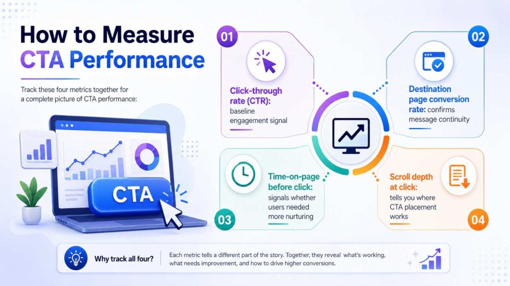
Track these four metrics together for a complete picture of CTA performance:
- Click-through rate (CTR): baseline engagement signal
- Destination page conversion rate: confirms message continuity
- Time-on-page before click: signals whether users needed more nurturing
- Scroll depth at click: tells you where CTA placement works
Set up event tracking in GA4 for each CTA independently. If you’re running multiple CTAs on a page, label them by position (Hero CTA, Mid-page CTA, Footer CTA) so your data is actionable — not aggregated into meaninglessness.
For companies running paid acquisition at scale, connecting CTA performance data back to campaign-level cost data is where real conversion rate optimization best practices begin. A CTA that lifts conversions by 15% on a high-traffic paid landing page is worth significant revenue.
Conclusion: CTA Optimization Is Revenue Optimization
CTA optimization isn’t a UX nicety. It’s a revenue decision. Every high-intent visitor who reaches your page and doesn’t click is a conversion you paid for — in ad spend, content effort, or SEO investment — and didn’t collect on.
The ten tactics above aren’t theoretical. They’re what high-growth digital businesses are using right now to squeeze more performance out of the traffic they already have. Some changes — like switching from second-person to first-person copy — take twenty minutes to implement and test. Others, like scroll-triggered CTAs and message-matched copy by traffic source, require a bit more architecture. Both are worth it.
Start with the one change that fits your highest-traffic page, implement it, measure it for two weeks, then move to the next. CTA optimization compounds. Small wins stack into meaningful conversion rate gains. Ready to build a CTA strategy that actually converts? Talk to the team at 6S Marketers, and let’s look at what your funnel is leaving on the table.
External Sources
Search Engine Land – 3 Tactics to Improve CTAs for Increased Relevance and Conversions
Google Developers – Web Fundamentals: Principles of Site Design