
You’ve done the work. The paid campaigns are running, SEO is pulling in traffic, and the numbers in Google Analytics look decent — until you check conversions. Crickets.
This happens constantly in B2B, and it’s rarely a traffic problem. Nine times out of ten, it’s a website experience problem. And the frustrating part? Standard analytics won’t tell you why people leave. They’ll tell you they left, sure. But the “why” stays hidden.
That’s where heatmaps for website become genuinely useful — not as a trendy tool, but as something that gives you a clear, visual read on real visitor behavior, where people click. How far they scroll. What they ignore completely.
For businesses that are serious about user experience optimization, heatmaps are more of a diagnostic necessity.
Key Takeaways
- Heatmaps show exactly where real visitors click and scroll.
- Cold zones on pages signal content that needs reworking.
- Scroll depth reveals whether key CTAs even get seen.
- Device segmentation changes everything — mobile behaves differently.
- Rage clicks are friction in its most visible form.
- Heatmap audits should be quarterly, not one-time exercises.
What Are Heatmaps
Think of a heatmap as a thermal image of your webpage. Bright reds and oranges show where visitors are most active — clicking, hovering, tapping. Blues and purples? That’s where attention drops off.
It’s a color-coded overlay on your actual web page, built from aggregated data across hundreds or thousands of sessions. No guessing, no gut instinct — just a picture of what’s actually happening.
The practical value is immediate. Your analytics might tell you a page has a 78% bounce rate. A heatmap tells you why — maybe your navigation is pulling people away before they even hit the main content, or your CTA button is sitting in a dead zone that barely anyone reaches.
That distinction — between knowing something is broken and knowing what is broken — is where user behavior tracking through heatmaps earns its keep.
Why Heatmaps for Website Matter for UX
Here’s something worth sitting with: most websites are built on assumptions. The design team assumes the layout makes sense. The content team assumes visitors read top to bottom. Leadership assumes the CTA is obvious.
Heatmaps challenge every single one of those assumptions — and they’re often right to.
We have seen cases where businesses completely rewrote their landing page copy, A/B tested headlines for months, and still couldn’t move the conversion needle. When heatmaps entered the picture, the issue was structural: 65% of visitors were bouncing before they ever hit the value proposition, because a noisy header section was eating all the scroll real estate.
No amount of copy tweaking fixes a scroll problem.
That’s the real argument for heatmaps. If your site is pulling traffic but generating zero leads, the gap between visitor and buyer is almost always a UX gap — and heatmaps are how you find it.
Some specific things they surface:
- Navigation elements that confuse more than guide
- Above-the-fold sections that bury the most important content
- Rage click clusters — visitors frantically clicking things that don’t respond
- Stark differences in mobile vs. desktop engagement on the same page
Types of Heatmaps for Website
Worth knowing: there isn’t just one kind of heatmap. Each variant solves a different problem.
- Click Maps are probably the most commonly used. They show where people click (or tap, on mobile). Great for seeing whether your CTAs are getting any love — or whether visitors are clicking on things that aren’t even links, which is a classic UX red flag.
- Scroll Maps show depth of engagement. They answer: How far does a typical visitor actually go before leaving? If 80% of your page never gets seen, you need to know that before spending another hour writing content for it.
- Move Maps tracks the cursor movement on the desktop. Since people tend to look where their mouse hovers, this acts as a rough proxy for reading patterns. Not perfect, but genuinely useful for understanding visual flow.
- Rage Click Maps deserve special attention. A rage click is when someone hammers on an element repeatedly — usually out of frustration because it’s not behaving as expected. These are your highest-priority UX fixes, full stop.
- Session Recordings typically come bundled with heatmap platforms. Technically, they’re separate, but the combination of aggregate heatmaps plus individual session playback is where the real diagnostic power sits.
How to Analyze Heatmap Data
Data without context is just noise. The analysis is where heatmaps actually pay off — and a few principles make that process sharper.
- Lead with a question. Walk into every heatmap review with something specific to investigate. “Why is our pricing page underperforming?” is far more useful than “let’s see what the heatmap shows.” Purposeful analysis beats exploratory browsing.
- Weight the pattern, not the anomaly. One session where someone rage-clicked your logo means nothing. Across 2,000 sessions? That’s a problem worth fixing. Heatmaps aggregate behavior, so treat outliers like outliers.
- Always split by device. This is always skipped more than it should be. Desktop and mobile visitors interact with the same page in dramatically different ways. A CTA that’s perfectly positioned above the fold on desktop might be buried three scrolls deep on a phone. Analyze them separately, always.
- Layer heatmaps over funnel data. If your heatmap shows heavy engagement on a CTA button but your analytics show low click-through, the bottleneck is probably on the page that button leads to — not the button itself. Heatmaps and conversion data answer different questions; use both.
- Make friction your focus. High activity on a dead element, erratic scroll patterns, repeated back-and-forth scrolling — these are signals of confusion. Prioritize eliminating friction before optimizing engagement.
Improving UX Using Heatmaps
Once the data starts speaking clearly, the path forward becomes a lot less abstract.
- Move CTAs to where eyes actually go. Scroll maps regularly reveal that the primary conversion point sits below where most visitors drop off. Moving that CTA up — without changing a word — has driven measurable lift for countless teams. It’s a low-effort, high-return fix.
- Simplify what’s cluttered. Click maps often show visitors wandering through secondary nav items and ignoring primary ones. That’s usually an information architecture problem. When your menu doesn’t match how people think about your offerings, they get lost — and leave.
- Kill the dead zones. If a content block is running cold across every session, it’s not earning its position on the page. Cut it, move it to a more logical spot, or swap it for something that actually supports the buying journey.
- Run smarter A/B tests. Instead of testing by instinct (“let’s try a different headline”), use heatmap data to identify what specifically isn’t working — then design your test around that insight. It’s the difference between random experimentation and structured optimization.
- Fix the mobile separately. Don’t assume what works on a desktop translates. Tap targets, scroll depth, and content prioritization — all of it shifts on smaller screens. Treat your mobile heatmaps as a separate product review.
When you’re ready to take behavioral data and turn it into a proper conversion strategy, the 6s Marketers team is worth a conversation.
Best Website Heatmaps Tools
The website heatmap tools market has matured considerably. A few platforms consistently rise to the top for serious teams:
Hotjar remains the go-to for most marketing and product teams. The combination of heatmaps, session recordings, and on-page feedback surveys in a single dashboard is hard to beat — especially for teams that don’t want to stitch together multiple tools for user behavior tracking.
Microsoft Clarity is worth serious attention, particularly given its free. It surfaces rage clicks and dead clicks automatically, includes session recording, and doesn’t cap your data — which matters more than people realize when running high-traffic pages.
Crazy Egg has been around long enough to earn its credibility. Its confetti report is particularly useful: it breaks click data down by traffic source, so you can see how organic visitors behave versus paid, versus email, and act accordingly.
Mouseflow and FullStory skew toward enterprise needs — deeper segmentation, error logging, funnel analysis within the tool itself. If you’re managing a complex digital product or large-scale site, they’re worth evaluating.
When choosing website heatmap tools, go beyond the feature checklist. Privacy compliance (GDPR, CCPA) matters. So does how the tool samples data — some only capture a percentage of sessions, which can skew results on lower-traffic pages.
6s Marketers works with growth-oriented businesses to build UX and data strategies that turn behavioral insights into measurable business outcomes.
Conclusion
Winning online isn’t always about spending more on traffic. Sometimes, often, actually, it’s about fixing what happens after visitors arrive.
Heatmaps for websites give teams a clear, actionable view of the experience they’re actually delivering, not the one they think they’re delivering. That gap between assumption and reality is where conversions go to die.
Start simple: install a heatmap tool on your five highest-traffic pages. Look at scroll depth first — it’s the fastest way to find wins. Segment by device before drawing any conclusions. Then layer in click data, reference your funnel analytics, and let the picture build over time.
This isn’t a one-week project. Teams that get the most from heatmaps treat them as a standing review — quarterly at minimum, monthly if you’re actively iterating on pages.
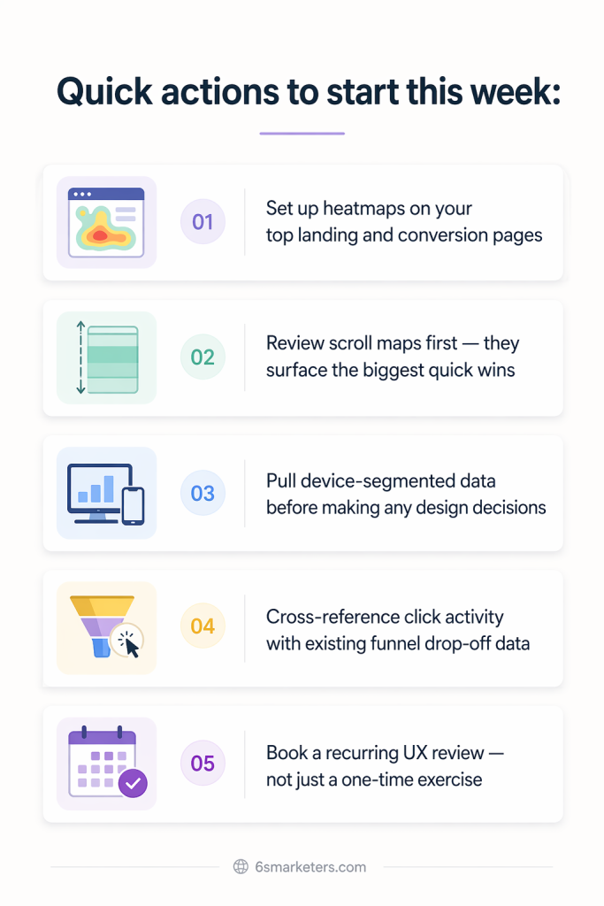
Quick actions to start this week:
- Set up heatmaps on your top landing and conversion pages
- Review scroll maps first — they surface the biggest quick wins
- Pull device-segmented data before making any design decisions
- Cross-reference click activity with existing funnel drop-off data
- Book a recurring UX review — not just a one-time exercise
Your website is live 24/7, and visitors form judgments in seconds. Make sure the experience reflects the quality of what you actually offer.